ScribeUp
Boosted user conversions by 12.8% with a smarter onboarding flow
Focus Areas:
Research
Strategy
User Interviews
Design
Dev Handoff
User Testing
Quality Assurance
Design
Quality Assurance
Software:
Project Overview
Reimagined onboarding for a B2C subscription management product
Problem
In mid–2024, ScribeUp’s product team observed a sharp decline in new user conversion, driven by a series of uncoordinated updates that made the onboarding process overly complex and inefficient. To address this, the team needed a fresh perspective to reassess the entire onboarding experience and streamline it for better user engagement.
Solution
After reviewing various internal analytics, it became clear that a consistent drop-off was occurring across several key onboarding screens. As a result, ScribeUp decided to revamp and rethink their entire onboarding process to better serve users and improve conversion rates.
My Role / Responsibilities
I was brought on as a freelance Product Designer to lead this effort, identify key friction points and redesign the current flow to improve activation and retention within their B2C offering.
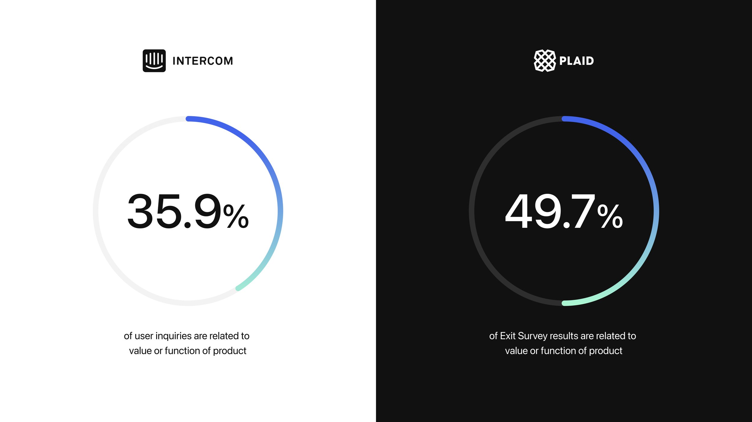
1 / Quantitative Analysis
A quantitative analysis was conducted using multiple data sources, including chatbot interactions from Intercom and exit survey results from Plaid, to identify the primary reasons users abandoned the onboarding process. The findings revealed that a lack of clarity about the product and its value proposition was a major factor in user drop-off, ultimately impacting conversion rates.
3 / User Interviews
In addition to data from third-party platforms, user interviews were conducted with both external users and internal stakeholders to evaluate the existing onboarding screens across desktop and mobile. Feedback was aggregated and analyzed to identify key bottlenecks, providing valuable insights into UX improvements aimed at increasing conversion rates.

4 / Key Focus Areas
Ultimately, these quantitative and qualitative insights shaped three key focus areas, forming the foundation for the final design solutions.
4 / Key Focus Areas
Ultimately, these quantitative and qualitative insights shaped three key focus areas, forming the foundation for the final design solutions.

6 / Module Structure
The analysis identified UX structure and the presentation of onboarding tasks as the first key area to address. Two approaches were explored: one consolidating all onboarding modules into a single screen and another adopting a more traditional, multi-screen flow. Ultimately, the multi-screen approach was chosen as the optimal solution.
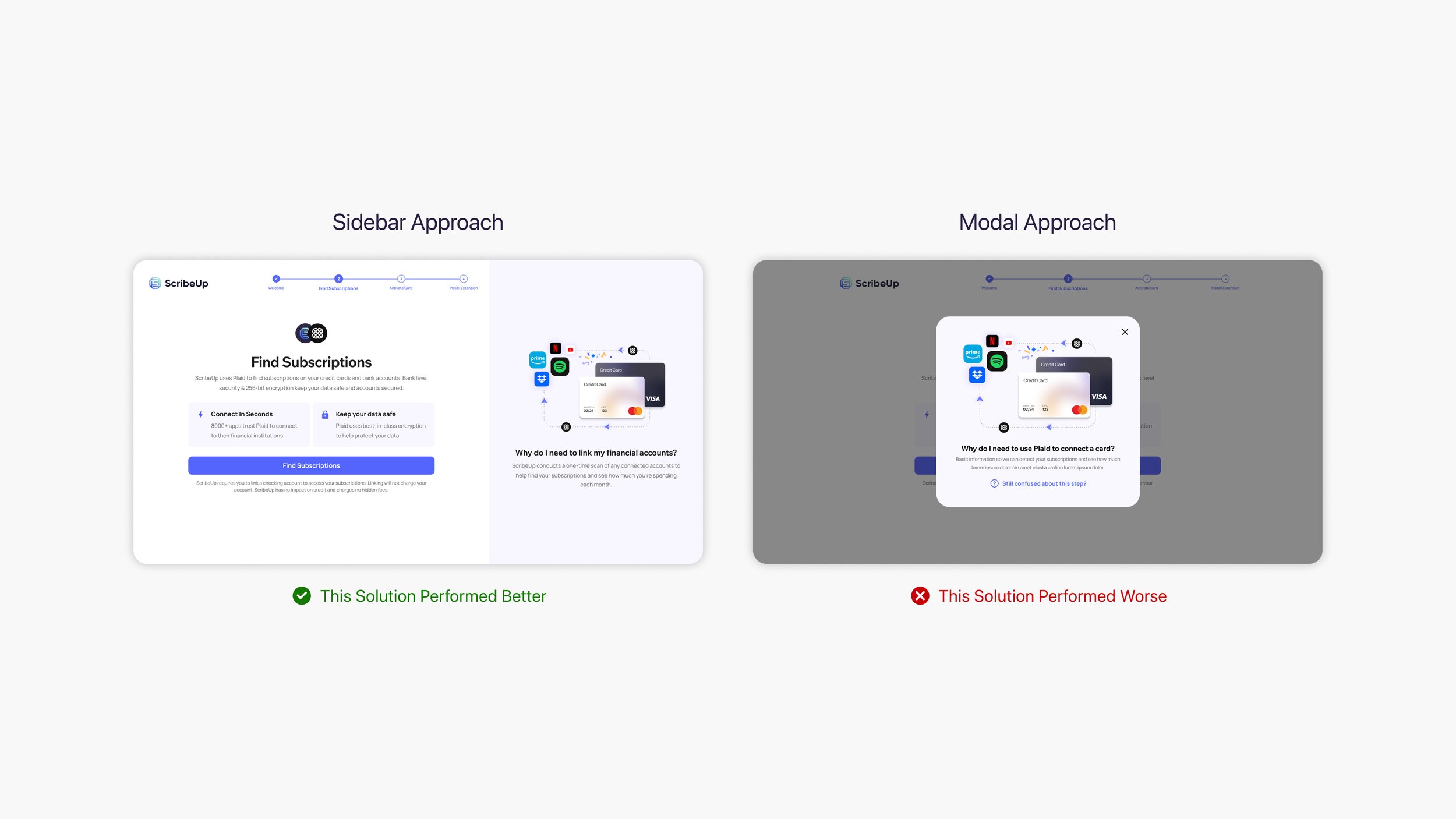
7 / Product Education
The second focus area addressed the presentation of product education. Two approaches were considered: one featuring a dedicated education sidebar that remained visible across all onboarding screens, and another using modals to present information as needed. Ultimately, the sidebar approach was selected for its clarity and effectiveness in guiding users.

8 / Virtual Card Messaging
The final focus area centered on the prominence of the ScribeUp Virtual Card during onboarding. One approach emphasized the card throughout the process, while the other minimized its presence until the final dashboard screen. Given its integral role in the product’s functionality and overall value, the high-emphasis approach was ultimately chosen.
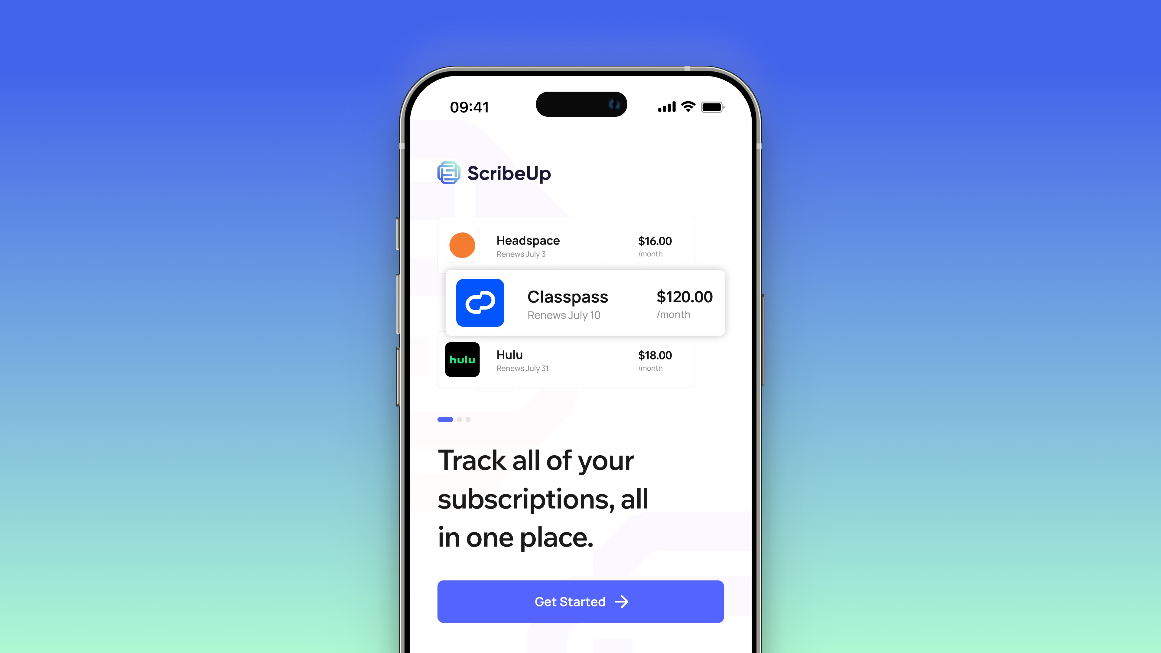
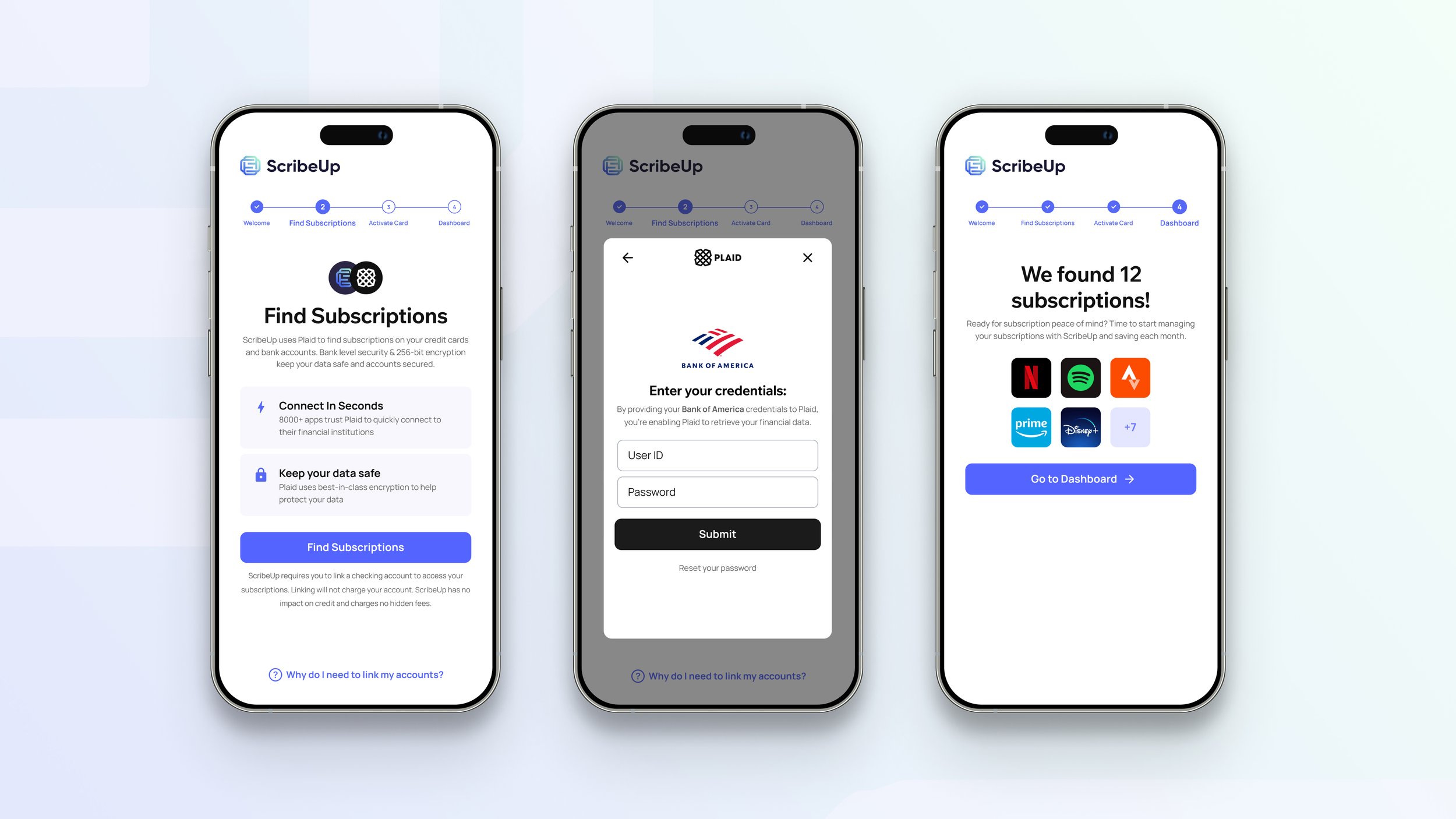
9 / Final Designs
Following a rigorous research and testing process, the final screens were thoughtfully designed to elevate ScribeUp’s B2C offering for the future. These updates prioritize user-friendliness and demonstrate a strong commitment to incorporating real customer feedback. Additionally, a comprehensive set of error states and edge case screens were developed to ensure a seamless experience for ScribeUp’s diverse user base.
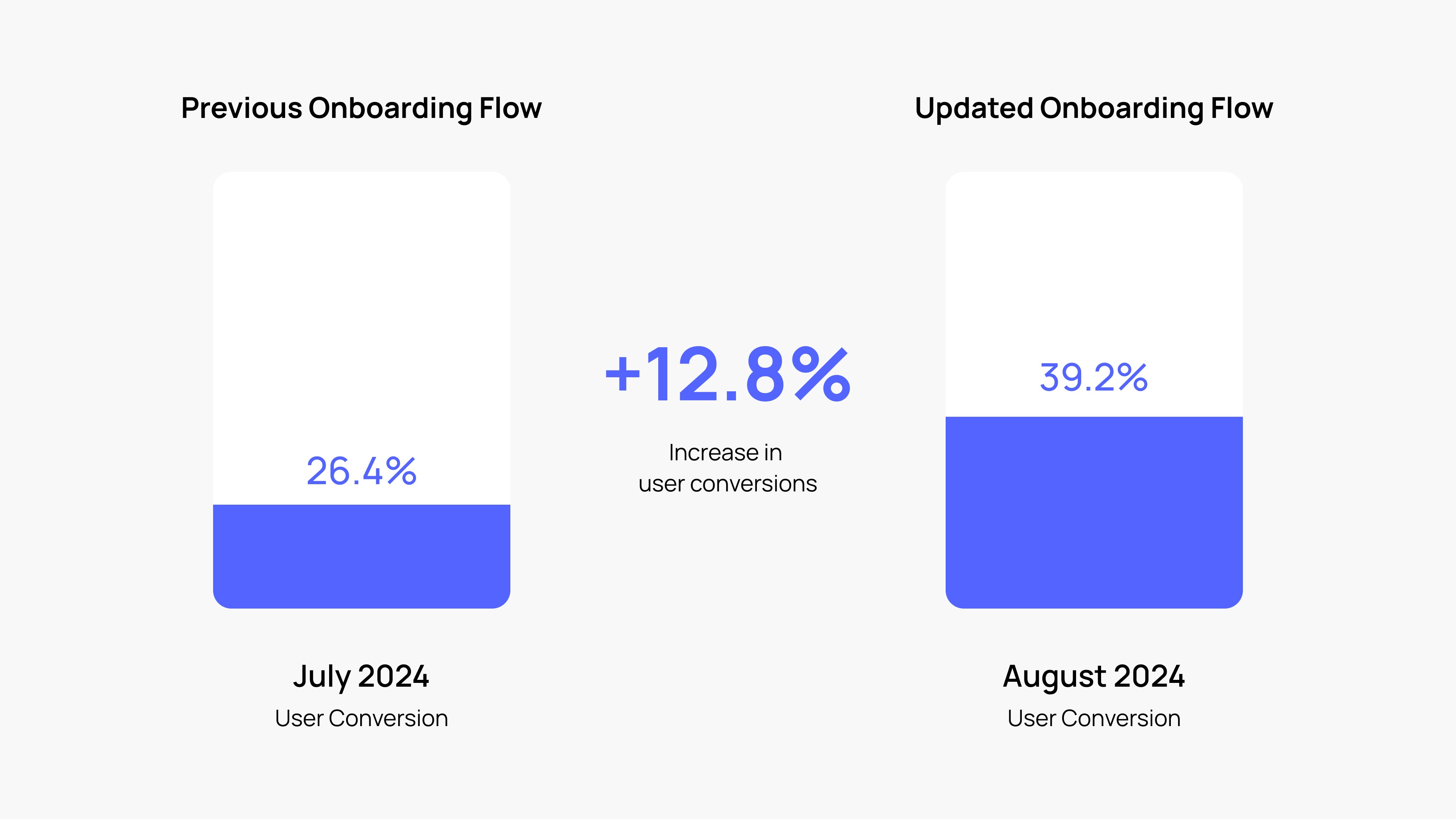
10 / Results
After streamlining the onboarding flow, user conversion increased from 26.4% to 39.2%. This 12.8% improvement, measured over a 30-day period, came from reducing friction and clarifying value propositions early in the journey. The redesign helped more users successfully complete onboarding and engage with the product.
2 / Qualitative Analysis
In addition to quantitative data, qualitative insights were gathered from multiple sources, most notably the user feedback channel on Slack, which aggregated feedback from various touchpoints. This analysis reinforced the finding that users struggled to understand how ScribeUp works and the benefits of signing up.
Research & Analysis
Comprehensive analysis to uncover user pain points
Research & Analysis
Comprehensive analysis to uncover user pain points
Solution Exploration
A variety of approaches to these key user painpoints were explored
Solution Exploration
A variety of approaches to these key user painpoints were explored
Launch & Results
Pragmatic changes that boosted user conversion
Launch & Results
Pragmatic changes that boosted user conversion
Research & Analysis
Comprehensive analysis to uncover user pain points
1 / Quantitative Analysis
A quantitative analysis was conducted using multiple data sources, including chatbot interactions from Intercom and exit survey results from Plaid, to identify the primary reasons users abandoned the onboarding process. The findings revealed that a lack of clarity about the product and its value proposition was a major factor in user drop-off, ultimately impacting conversion rates.
2 / Qualitative Analysis
In addition to quantitative data, qualitative insights were gathered from multiple sources, most notably the user feedback channel on Slack, which aggregated feedback from various touchpoints. This analysis reinforced the finding that users struggled to understand how ScribeUp works and the benefits of signing up.
3 / User Interviews
In addition to data from third-party platforms, user interviews were conducted with both external users and internal stakeholders to evaluate the existing onboarding screens across desktop and mobile. Feedback was aggregated and analyzed to identify key bottlenecks, providing valuable insights into UX improvements aimed at increasing conversion rates.
4 / Key Focus Areas
Ultimately, these quantitative and qualitative insights shaped three key focus areas, forming the foundation for the final design solutions.
1 / Quantitative Analysis
2 / Qualitative Analysis
3 / User Interviews
4 / Key Focus Areas
Solution Exploration
A variety of approaches to these key user painpoints were explored
6 / Module Structure
The analysis identified UX structure and the presentation of onboarding tasks as the first key area to address. Two approaches were explored: one consolidating all onboarding modules into a single screen and another adopting a more traditional, multi-screen flow. Ultimately, the multi-screen approach was chosen as the optimal solution.
7 / Product Education
The second focus area addressed the presentation of product education. Two approaches were considered: one featuring a dedicated education sidebar that remained visible across all onboarding screens, and another using modals to present information as needed. Ultimately, the sidebar approach was selected for its clarity and effectiveness in guiding users.
8 / Virtual Card Messaging
The final focus area centered on the prominence of the ScribeUp Virtual Card during onboarding. One approach emphasized the card throughout the process, while the other minimized its presence until the final dashboard screen. Given its integral role in the product’s functionality and overall value, the high-emphasis approach was ultimately chosen.
6 / Module Structure
7 / Product Education
8 / Virtual Card Messaging
Launch & Results
Pragmatic changes that boosted user conversion
9 / Final Designs
Following a rigorous research and testing process, the final screens were thoughtfully designed to elevate ScribeUp’s B2C offering for the future. These updates prioritize user-friendliness and demonstrate a strong commitment to incorporating real customer feedback. Additionally, a comprehensive set of error states and edge case screens were developed to ensure a seamless experience for ScribeUp’s diverse user base.
10 / Results
After streamlining the onboarding flow, user conversion increased from 26.4% to 39.2%. This 12.8% improvement, measured over a 30-day period, came from reducing friction and clarifying value propositions early in the journey. The redesign helped more users successfully complete onboarding and engage with the product.
9 / Final Designs
10 / Results