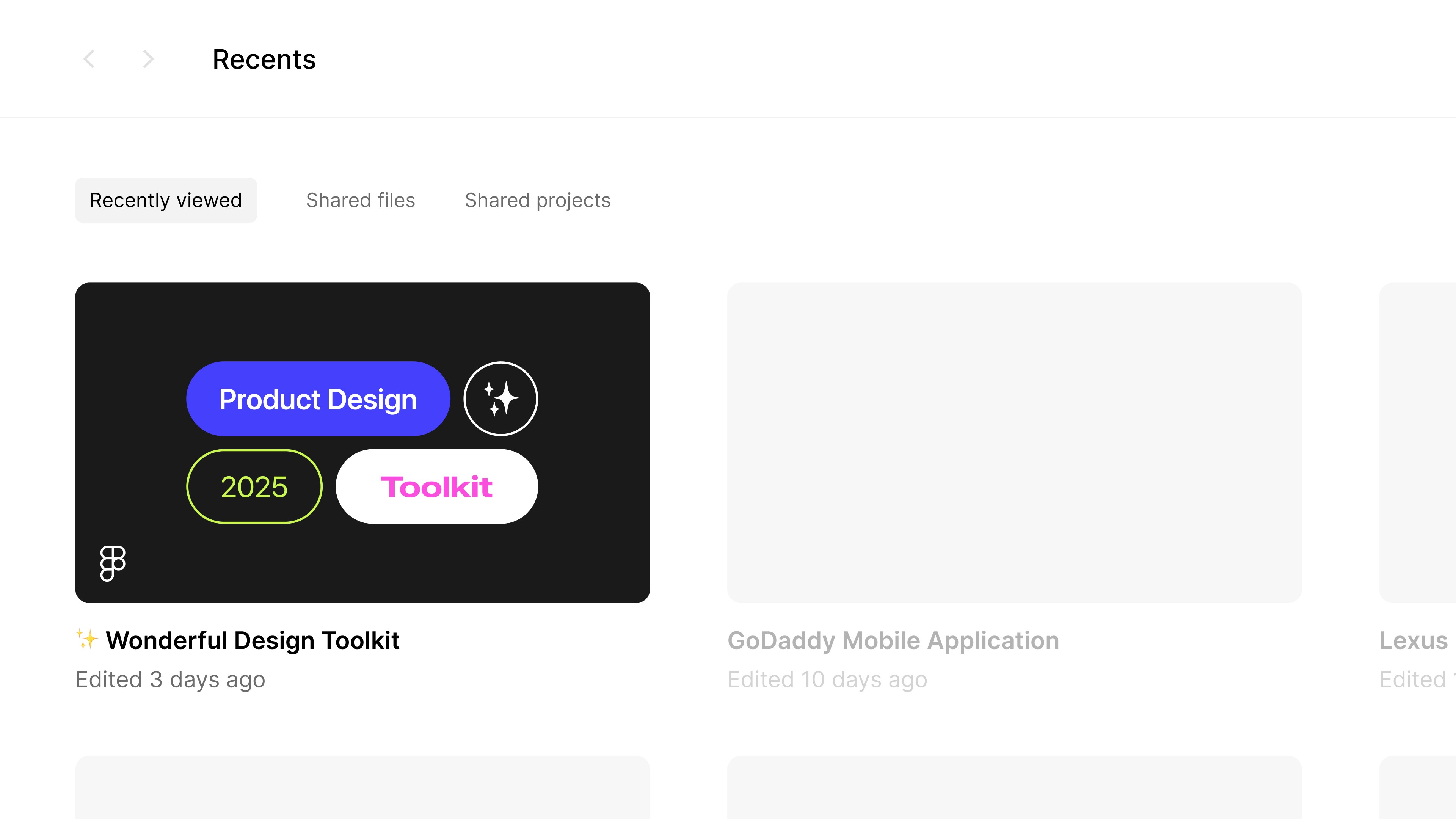
Wonderful
Reimagined design system that accelerated shipping velocity by 18.3%
Focus Areas:
Research
User Interviews
Design Systems
User Testing
Quality Assurance
Design Systems
Quality Assurance
Software:

Project Overview
Flexible design system that enables agency to build a range of digital products.
Problem
Wonderful Collective is a design agency that builds custom digital products for a range of end clients. At the start of any new project, an internal Figma file is generated containing a pre-established library of design components. Wonderful’s system was overly complex, outdated and did not serve the needs of designers, developers and PMs. How can this document be rebuilt to make the process of building digital products easier for all agency stakeholders?
Solution
Three solution areas were developed to streamline the workflow for all project stakeholders. For designers, a lean, powerful component system was created, focusing on usability, flexibility and speed. For developers, robust technical guidelines were included alongside components to ensure consistent usage and ease of dev handoff. Finally, for product owners, the file's UX was enhanced for better organization, with additional organization tags included to track production goals.
My Role / Responsibilities
As a designer who worked with the previous Wonderful Collective design toolkit many times, I was asked to rebuild the entire system to increase usability for all project stakeholders.
Challenges
Wonderful services many clients, all with different UI & technical requirements.
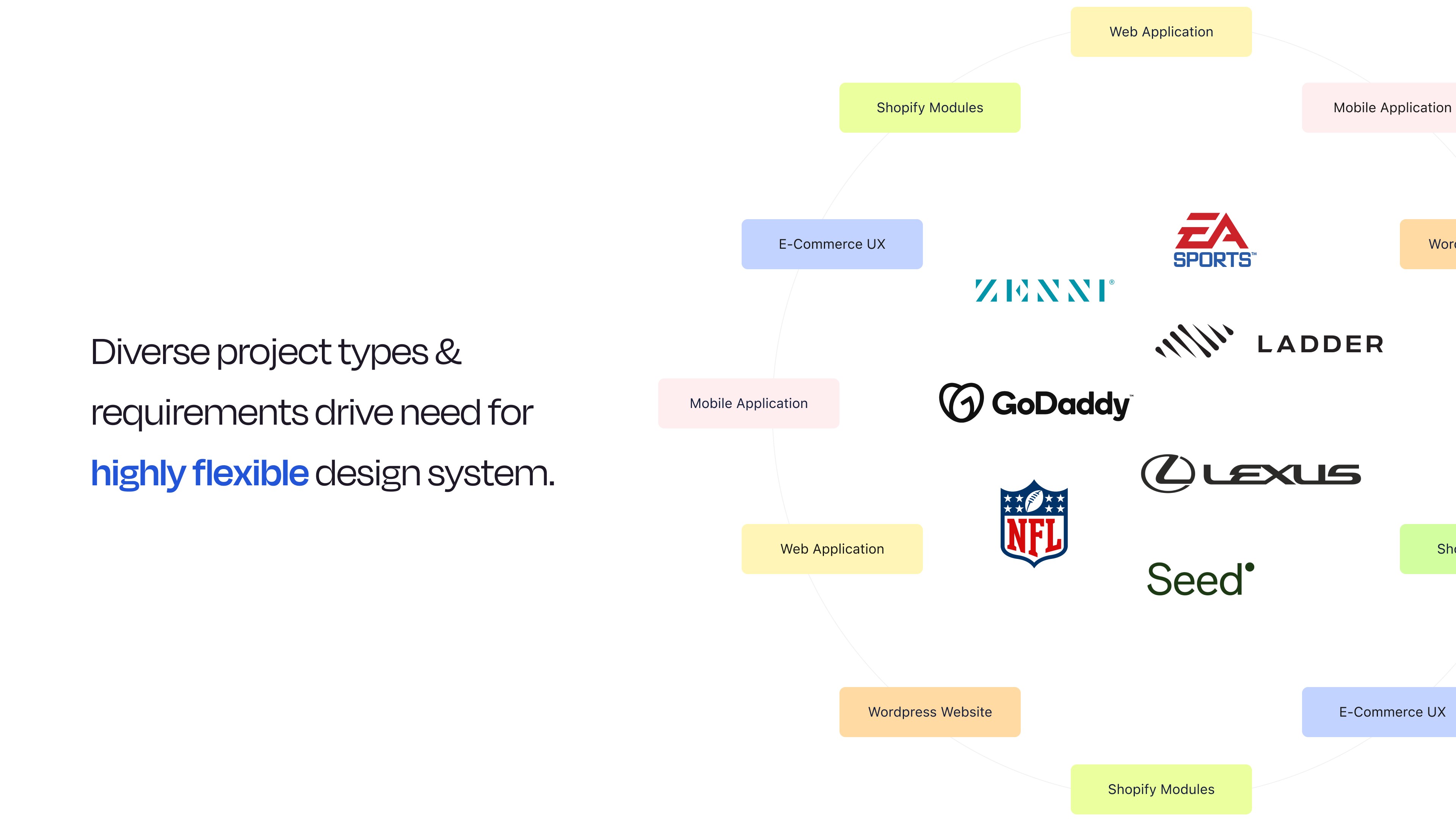
1 / Project Diversity
One of the primary challenges of building a new design system stemmed directly from the diversity of projects and clients at Wonderful. The firm services clients across many industries and builds a range of products including web applications, apps, custom e-commerce solutions, Shopify modules and more. Given this range, it was important to keep the toolkit highly adaptable and focused towards key pieces of UI.
2 / Current System Flaws
Alongside the challenge of project diversity, Wonderful’s current system was flawed. Many components lacked flexible sizing and were built in overly complex ways. This resulted in unnecessary headaches for designers as they spent large amounts of time modifying and adapting broken components into their design projects. These inefficiencies also bled into the development process, as many of these components ultimately became very difficult to code. Lastly, the file itself was disorganized and lacked proper naming conventions/progress tags, driving further confusion.
1 / Project Diversity
2 / Current System Flaws

Solutions
One solution for designers, one for developers & one for PMs.
3 / Restructured Components
Through analysis of component usage patterns from past projects, superfluous design elements were eliminated, focusing greater attention on the core pieces that designers actually used. These usable components were tested on their ease of edibility and structurally simplified to lighten the workload for designers at project kickoff. This revised structure made the library more approachable for the design team, leading to higher component usage and more consistent implementation.
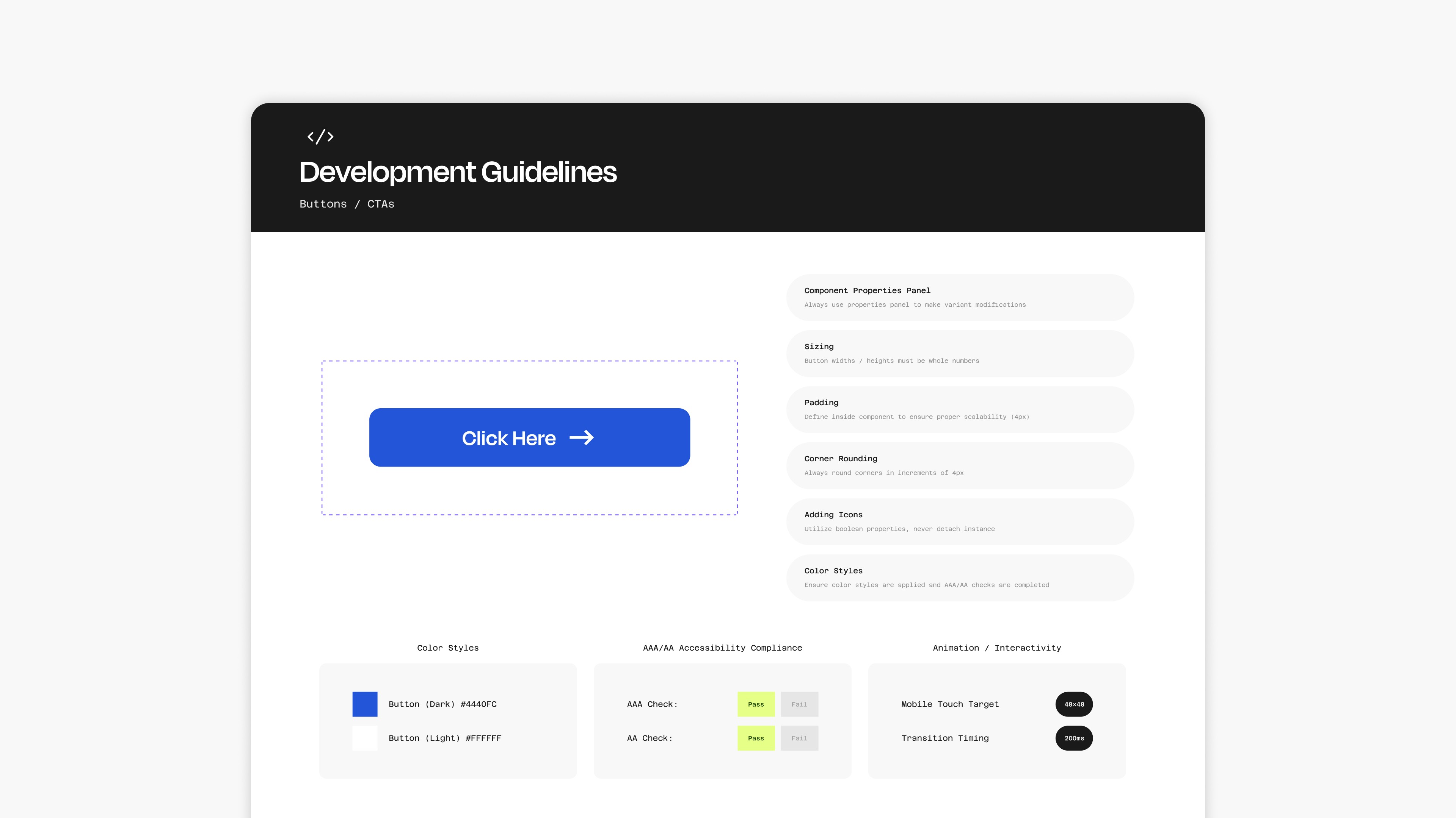
4 / Proactive Development Guidelines
To streamline the design-to-development process, comprehensive technical development guidelines were built. These guidelines serve as a bridge between design and engineering teams, offering detailed specifications for component editing, implementation and behavior. This reduces ambiguity and streamlines the design-to-development handoff process, resulting in faster development cycles and more consistent implementation of the design system across digital products.
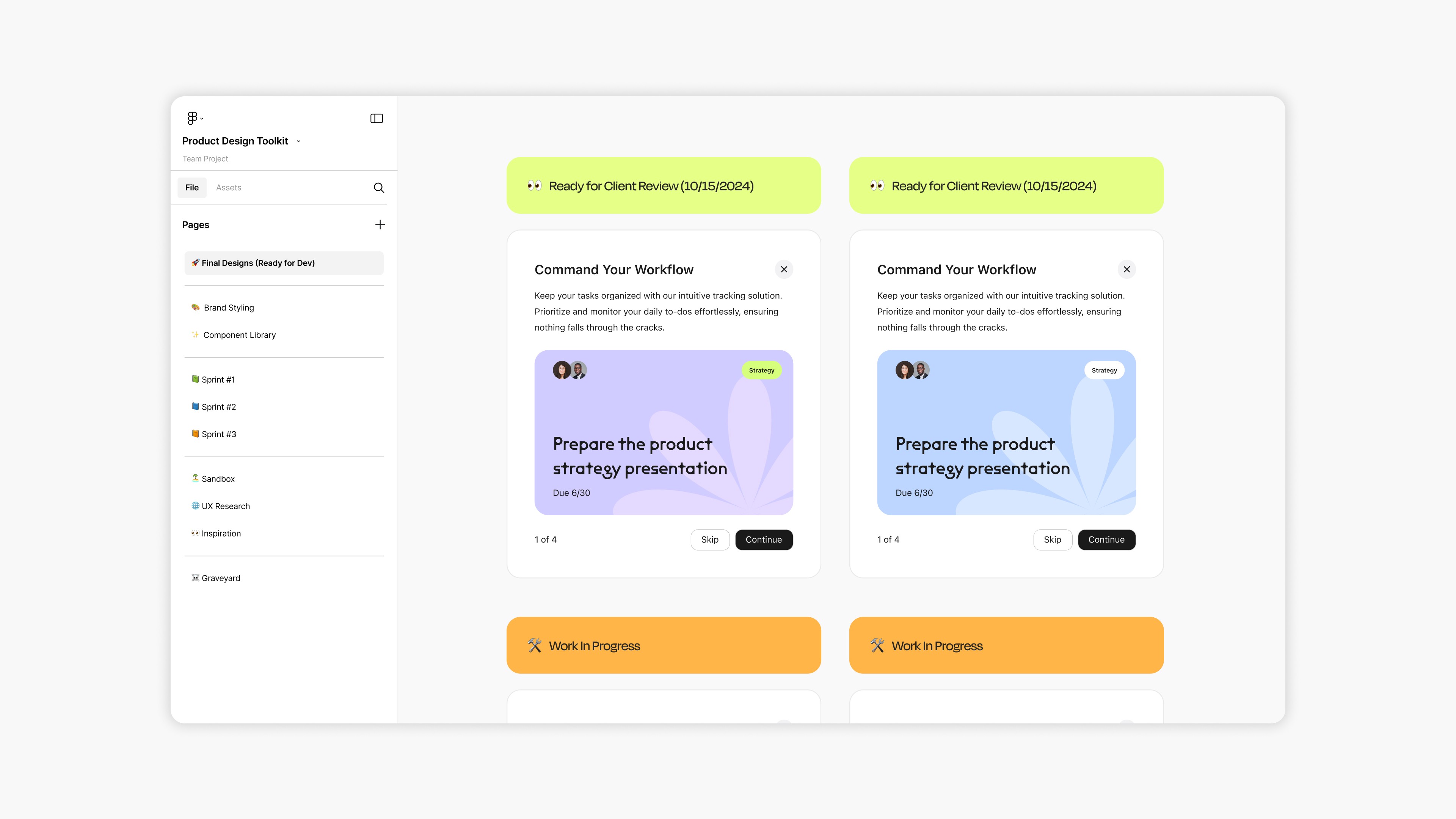
5 / File Organization
Lastly, the Figma file was reorganized to create better pathways for non-technical team members to access and understand project assets. Components, design inspiration, UX research and brand styling were all given their own distinct layers alongside very clear sprint pages for stakeholders to access. Additionally, progress tags were added to help keep track of designs as they move through the design and development pipeline. This reorganized system enables PMs to easily answer client inquiries and keep project goals on track.
3 / Restructured Components

4 / Proactive Development Guidelines
5 / File Organization
Results
Proven results post-implementation
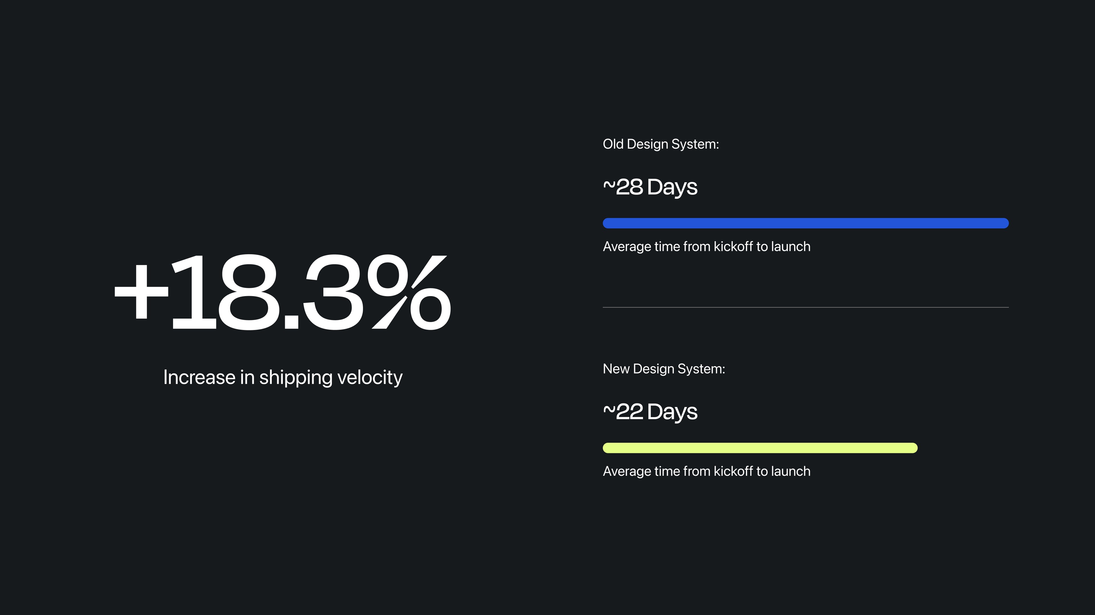
6 / Results
Following the rollout of the design system, average delivery time from client kickoff to launch dropped from 28 to 22 work days. This represented an 18.3 percent increase in shipping velocity and enabled the team to deliver projects faster, reduce production overhead, and take on more work without adding headcount.
6 / Results
Project Overview
Flexible design system that enables agency to build a range of digital products.
Problem
Wonderful Collective is a design agency that builds custom digital products for a range of end clients. At the start of any new project, an internal Figma file is generated containing a pre-established library of design components. Wonderful’s system was overly complex, outdated and did not serve the needs of designers, developers and PMs. How can this document be rebuilt to make the process of building digital products easier for all agency stakeholders?
Solution
Three solution areas were developed to streamline the workflow for all project stakeholders. For designers, a lean, powerful component system was created, focusing on usability, flexibility and speed. For developers, robust technical guidelines were included alongside components to ensure consistent usage and ease of dev handoff. Finally, for product owners, the file's UX was enhanced for better organization, with additional organization tags included to track production goals.
My Role / Responsibilities
As a designer who worked with the previous Wonderful Collective design toolkit many times, I was asked to rebuild the entire system to increase usability for all project stakeholders.
2 / Current System Flaws
Alongside the challenge of project diversity, Wonderful’s current system was flawed. Many components lacked flexible sizing and were built in overly complex ways. This resulted in unnecessary headaches for designers as they spent large amounts of time modifying and adapting broken components into their design projects. These inefficiencies also bled into the development process, as many of these components ultimately became very difficult to code. Lastly, the file itself was disorganized and lacked proper naming conventions/progress tags, driving further confusion.
3 / Restructured Components
Through analysis of component usage patterns from past projects, superfluous design elements were eliminated, focusing greater attention on the core pieces that designers actually used. These usable components were tested on their ease of edibility and structurally simplified to lighten the workload for designers at project kickoff. This revised structure made the library more approachable for the design team, leading to higher component usage and more consistent implementation.
4 / Proactive Development Guidelines
To streamline the design-to-development process, comprehensive technical development guidelines were built. These guidelines serve as a bridge between design and engineering teams, offering detailed specifications for component editing, implementation and behavior. This reduces ambiguity and streamlines the design-to-development handoff process, resulting in faster development cycles and more consistent implementation of the design system across digital products.
5 / File Organization
Lastly, the Figma file was reorganized to create better pathways for non-technical team members to access and understand project assets. Components, design inspiration, UX research and brand styling were all given their own distinct layers alongside very clear sprint pages for stakeholders to access. Additionally, progress tags were added to help keep track of designs as they move through the design and development pipeline. This reorganized system enables PMs to easily answer client inquiries and keep project goals on track.
6 / Results
Following the rollout of the design system, average delivery time from client kickoff to launch dropped from 28 to 22 work days. This represented an 18.3 percent increase in shipping velocity and enabled the team to deliver projects faster, reduce production overhead, and take on more work without adding headcount.
6 / Results
Following the rollout of the design system, average delivery time from client kickoff to launch dropped from 28 to 22 work days. This represented an 18.3 percent increase in shipping velocity and enabled the team to deliver projects faster, reduce production overhead, and take on more work without adding headcount.
1 / Project Diversity
One of the primary challenges of building a new design system stemmed directly from the diversity of projects and clients at Wonderful. The firm services clients across many industries and builds a range of products including web applications, apps, custom e-commerce solutions, Shopify modules and more. Given this range, it was important to keep the toolkit highly adaptable and focused towards key pieces of UI.
Challenges
Wonderful services many clients, all with different UI & technical requirements.
Challenges
Wonderful services many clients, all with different UI & technical requirements.
Solutions
One solution for designers, one for developers & one for PMs.
Solutions
One solution for designers, one for developers & one for PMs.
Results
A revised system that empowers the team and drives value to clients.
Results